 |

|
|
|
|
|
Notice: Undefined index: URL in /hermes/bosnacweb08/bosnacweb08bb/b1525/dot.digitalgrunt/public_html/catalogue.php on line 55
Notice: Trying to access array offset on value of type null in /hermes/bosnacweb08/bosnacweb08bb/b1525/dot.digitalgrunt/public_html/catalogue.php on line 55
Notice: Undefined index: URL in /hermes/bosnacweb08/bosnacweb08bb/b1525/dot.digitalgrunt/public_html/catalogue.php on line 55
Notice: Trying to access array offset on value of type null in /hermes/bosnacweb08/bosnacweb08bb/b1525/dot.digitalgrunt/public_html/catalogue.php on line 55
Notice: Undefined index: URL in /hermes/bosnacweb08/bosnacweb08bb/b1525/dot.digitalgrunt/public_html/catalogue.php on line 55
Notice: Trying to access array offset on value of type null in /hermes/bosnacweb08/bosnacweb08bb/b1525/dot.digitalgrunt/public_html/catalogue.php on line 55
Notice: Undefined index: URL in /hermes/bosnacweb08/bosnacweb08bb/b1525/dot.digitalgrunt/public_html/catalogue.php on line 55
Notice: Trying to access array offset on value of type null in /hermes/bosnacweb08/bosnacweb08bb/b1525/dot.digitalgrunt/public_html/catalogue.php on line 55
Notice: Undefined index: URL in /hermes/bosnacweb08/bosnacweb08bb/b1525/dot.digitalgrunt/public_html/catalogue.php on line 55
Notice: Trying to access array offset on value of type null in /hermes/bosnacweb08/bosnacweb08bb/b1525/dot.digitalgrunt/public_html/catalogue.php on line 55
Notice: Undefined index: URL in /hermes/bosnacweb08/bosnacweb08bb/b1525/dot.digitalgrunt/public_html/catalogue.php on line 55
Notice: Trying to access array offset on value of type null in /hermes/bosnacweb08/bosnacweb08bb/b1525/dot.digitalgrunt/public_html/catalogue.php on line 55
Notice: Undefined index: URL in /hermes/bosnacweb08/bosnacweb08bb/b1525/dot.digitalgrunt/public_html/catalogue.php on line 55
Notice: Trying to access array offset on value of type null in /hermes/bosnacweb08/bosnacweb08bb/b1525/dot.digitalgrunt/public_html/catalogue.php on line 55
Notice: Undefined index: URL in /hermes/bosnacweb08/bosnacweb08bb/b1525/dot.digitalgrunt/public_html/catalogue.php on line 55
Notice: Trying to access array offset on value of type null in /hermes/bosnacweb08/bosnacweb08bb/b1525/dot.digitalgrunt/public_html/catalogue.php on line 55
Notice: Undefined index: URL in /hermes/bosnacweb08/bosnacweb08bb/b1525/dot.digitalgrunt/public_html/catalogue.php on line 55
Notice: Trying to access array offset on value of type null in /hermes/bosnacweb08/bosnacweb08bb/b1525/dot.digitalgrunt/public_html/catalogue.php on line 55
Notice: Undefined index: URL in /hermes/bosnacweb08/bosnacweb08bb/b1525/dot.digitalgrunt/public_html/catalogue.php on line 55
Notice: Trying to access array offset on value of type null in /hermes/bosnacweb08/bosnacweb08bb/b1525/dot.digitalgrunt/public_html/catalogue.php on line 55
Notice: Undefined index: URL in /hermes/bosnacweb08/bosnacweb08bb/b1525/dot.digitalgrunt/public_html/catalogue.php on line 55
Notice: Trying to access array offset on value of type null in /hermes/bosnacweb08/bosnacweb08bb/b1525/dot.digitalgrunt/public_html/catalogue.php on line 55
Notice: Undefined index: URL in /hermes/bosnacweb08/bosnacweb08bb/b1525/dot.digitalgrunt/public_html/catalogue.php on line 55
Notice: Trying to access array offset on value of type null in /hermes/bosnacweb08/bosnacweb08bb/b1525/dot.digitalgrunt/public_html/catalogue.php on line 55
|
 |
 |

- View Project - |
Client: ICP
Photoshop, Illustrator
Looking for a visual departure from their typical graphic style, ICP needed a new look to capture their new album release entitled "The Calm". Intended as a prelude to the later release of "The Tempest", the idea behind this cover is to present a devastating storm on the horizon as a metaphor for the album to come. To go with a crop-circle theme, new ICP logos were developed along with this album for use with album graphics and on merchandising.
|
|
 |
 |
|
|
|
|

- View Project - |
Client: Boondox
Illustrator, Logo Design
Designed with multiple mediums in mind, Boondox's logo uses only 3 colors to create a provocative and easy-to-reproduce image. Details such as the woodgrain in on the logotype can be peeled away for situations where detail is at a premium, such as with a patch. In other situations such as a promo poster the full detail of the logo can be presented. Despite being made of simple flat colors, the logo stands up well with the visual direction of Boondox's album, "The Harvest".
Building upon the visual vocabulary established with the initial logo design, the Boondox logo continued to evolve with each new album. As time has passed, so too has the "Boondox Signpost" been worn down by rot and the elements, yet is still completely identifiable with the original brand. This again illustrates the ability of the design to adapt and evolve as needed.
|
|
|
|
|
|
|
|

- View Project - |
Client: Gathering of the Juggalos 2007
Photoshop, Typography
The Gathering of the Juggalos is an outdoor music festival lasting four days and held at a campground. Each year, map flyers are produced to help attendees understand where everything is located on the grounds. For this most recent year's map, the map was made with more of a treasure map theme, giving the new grounds a greater sense of history and mystery alike. Care was taken to make sure each category of information was addressed in a distinct yet similar style, making it easier to find what you are looking for once you are familiar with the map. Though without a key the map can be at first a bit overwhelming, in this case what it loses in functionality it more than makes up for with visual impact.
|
|
|
|
|
|
|
|
- View Project - |
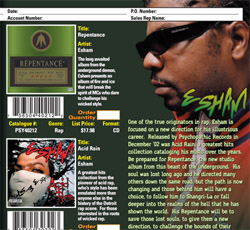
Client: Psychopathic Records
Photoshop, Illustrator
When Psychopathic Records signed with Sony's Red Distribution to handle its North American record distribution, the back catalogue of albums -- over nine years of albums -- was now for the first time going to be made widely available to the public. To help promote these old releases and spread awareness of the acts on Psychopathic Records at the time, I came up with this four-page catalogue folder. Designed to also function as an ordering form, this booklet was sent off to retailers for sales promotion as well as to media contacts to promote label awareness.
|
|
|
|
|
|
|
|

- View Project - |
Client: Dark Lotus
Art Direction, Typography, Illustrator, Photoshop
Dark Lotus is a collaboration project between the best-selling artists of Psychopathic Records. They are always presented with an air of mystery and sophistication, and as such, I pitched the idea of representing their latest release using imagery of the Terracotta Army of the First Emperor of China. Color adjustment adds to the impact of these striking photos. Several different type faces are brought together to build the information hierarchy of this piece, and despite their varying natures, they all work together to enhance the content of this piece.
|
|
|
|
|
|
|
|

- View Project - |
Client: Wayne State University
Freehand
This form was part of a pitch to change the complicated system of adding or dropping a class from a student's schedule at Wayne State University. The concept was to make the form simplier for students and staff, removing many of the technical jargon used only in extremely rare circumstances in favor of a less-imposing, easy-to-understand design. The clean and simple layout incorporates lots of white space to keep an uncluttered and uncomplicated feel to the form.
|
|
|
|
|
|
|
|

- View Project - |
Client: Psychopathic Records
Illustrator, Art Direction
Upon entering its 7th year as an annual event, I took it upon myself to create a new logo for the Gathering of the Juggalos. Now an outdoor event, the Gathering had begun to develope its own identity, which I captured in this logo. The bottle rocket represents the Faygo the fans in attendance of at the Gathering of the Juggalos spray on each other during concerts, with the sun maintaining branding for Psychopathic Records and helping draw reference to the outdoor nature of the event. Keeping merchandising in mind, the colors of logo are easily changeable into any number of "flavors", allowing for a wide range of clothing and other merchandise options.
|
|
|
|
|
|
|
|

- View Project - |
Client: Zug Izland
Photoshop, Illustrator
A promotional single distributed to radio stations, the graphics for Prison Song were designed to be provocative and stand out. The cover features a photo of the Dickerson Detention Center, and the tray shows of the band in from of the legendary industrial island their band is named for.
|
|
|
|
|
|
|
|

- View Project - |
Client: Shaggy 2 Dope (of ICP)
Photoshop, Illustrator, Content Development
A solo album for one-half of Insane Clown Posse, this album entitled "F.T.F.O." (Fxck the Fxck Off) was a follow-up to Shaggy 2 Dope's earlier EP "Fxck Off!". The main focus of the marketing material was Shaggy's memorable face. Coupling the monochromatic facepaint and outfits with colorful supporting graphics gave each project a striking look. I worked with the in-house copy editor to streamline the press kit material for this release to a manageable reading size while maintaining the highest degree of impact and relevance; the results of speak for themselves.
|
|
|
|
|
|
|
|

- View Project - |
Client: Insane Clown Posse
Quark, Photoshop
A 600+ page autobiography predominently told by one-half of Insane Clown Posse, Behind the Paint is the story of Violent J's rise to fame and glory. From his humble childhood to his early tour years to dealing with the burdens of success, this book covers the history of ICP from the beginning all the way to its time of publication in 2003. Each chapter features an artistic spread to establish the theme of developing story. Great care was taken with each page to make sure the book was full of photography and other supporting imagery, appealing to people who don't usually read a lot of books. The dimensions of the book was also designed with casual reading in mind, being large enough to be held easily in any position while not awkward when reading laying down. The volume of pages was also an intentional decision to give the reader a greater sense of confidence as they could see their progress with each chapter.
|
|
|
|
|
|
|
|

- View Project - |
Client: ICP, Esham, ABK
Photoshop
This admat was made to promote the seven-city Diamonds Raining Tour featuring Insane Clown Posse, Esham, and ABK. While ICP headlined the tour, it was important to keep Esham and ABK prominent as both performers were also big draws for the fan base. The tour marked ICP's first return to the stage in over a year, and was branded to draw reference to their then-recent album release, "The Wraith: Shangri-La".
|
|
|
|
|
|
|
|

- View Project - |
Client: Pro or Con 2007
Illustrator, Jewelry-Making
This is a set of medals custom-designed and crafted for a local miniature gaming convention tournament. Each medal is designed to draw reference to the imagery of steam-powered fantasy world of Warmachine without directly linking any given medal to one of its various factions. I produced and finished each medal in addition to developing their designs. All of them have functioning pin-backs, and are approximately two inches wide. The medals, from left to right, are named as follows: "Executioner", "Mage Killer", "Vanquisher", and "Master Craftsman".
|
|
|
|
|
|
 |